(Don't) Flip This House
5 telltale signs your Dallas home is the victim of a bad flipper

Obviously, I'm no Candy Evans, the doyenne of Dallas real estate and founder of Candy's Dirt, and possess little more than a typical homeowner's knowledge of our real estate market.
But ever since early 2016, when a friend bought a house in Casa View, I've been watching the churn in that real estate microcosm on the far-far east side of Dallas.
Back in January 2016, it was still possible to find a 1,200-square-foot house with 3 BR and 1.5 BA for under $100,000. This price range put the neighborhood on a Realtor-circulated list of "top 10 places in the U.S. for investors" — and brought in an onslaught of flippers who began snapping up '50s-era houses from the dying widow owners.
These are sweet little houses with quintessential '50s character: original hardwood floors, pastel-tiled bathrooms, rick-rack wood trim on the bedroom closets, and the occasional wood wainscoting.
These features have survived for 70 years, and there's no reason to think they wouldn't survive another 70. But flippers don't make fast money preserving original characteristics; they make money inflicting crappy remodels on sweet old houses that would really be better off left alone.
It's a drag to watch these houses lose their uniqueness one by one, egged on by a real estate industry that waxes on about taking a home "down to the studs." Those words should send a cold shiver. (In fact, there are '50s ranches in very nice North Dallas ZIP codes, such as 75230, where gutting has put the foundations in peril.)
If you're so hot for an open floor plan, why not buy a house built in the 1970s, when open floor plans really took off and the houses were built that way from the get-go?
People, let the kitchen walls stand.
Invariably, the same flippers who trash a cool period-era Formica countertop, only to replace it with another dull slab of granite, will ignore the less sexy but more essential improvements to the infrastructure, such as the electrical system and windows.
After two years of obsessively witnessing the havoc flippers wreak, certain trends emerge.
Here are 5 telltale signs that the "completely updated" house just up for sale has been the victim of a bad flip:
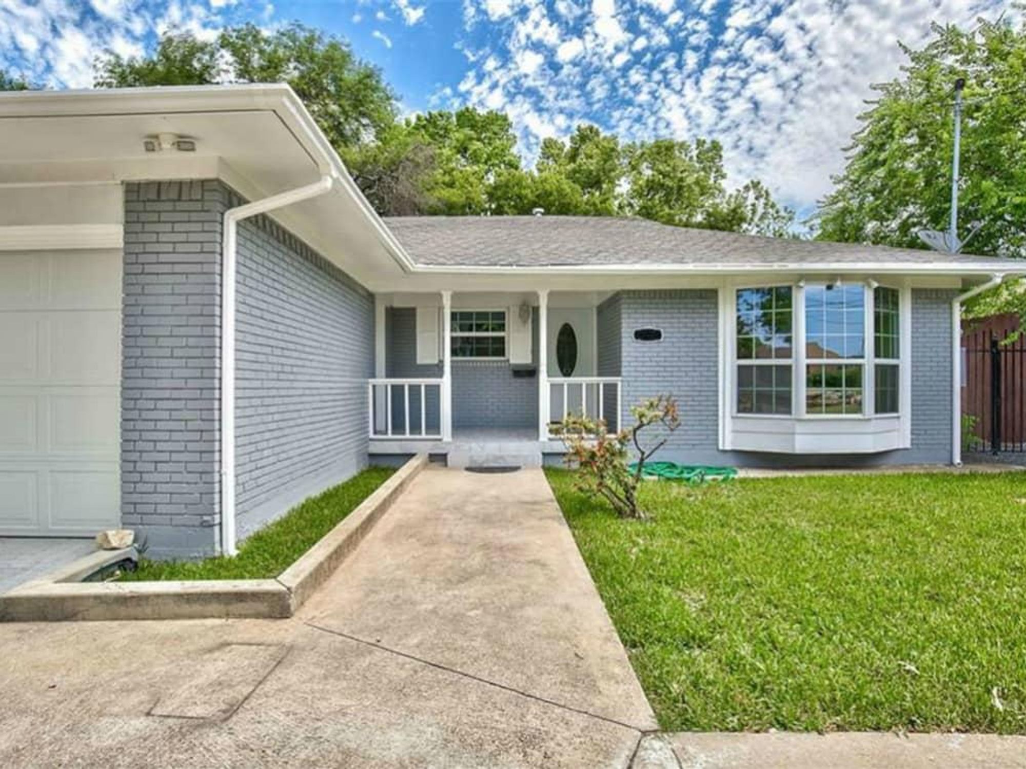
The house is painted gray. If you see a brick home from the '50s that's been painted gray, then a "Danger" sign should flash before your eyes. First of all, it's become such an overwhelming trend that it's already a cliche. Second, any time you paint anything, you have to repaint it down the road. Maintenance. Whereas with an unpainted brick house, you don't have to do a thing.
But the worst thing about a brick house that's been painted is that it's usually trying to hide something — it could be a crack in the brick or a foundation issue, but it's something that the paint covers.
Note: Gray has become so ubiquitous that flippers are starting to move on to shades of white.
Big dumb rustic wood. The blame for this trend goes straight to Fixer Upper Joanna Gaines, for whom the use of rough-hewn wood as a design element is a signature. By late 2016, HGTV was already calling it "a trend we can't wait to say goodbye to in 2017," which makes it perfect fodder for clueless flippers in 2018.
Like gray paint, big dumb rustic wood can hide a multitude of sins. A beam of it installed as a decorative element across the center of a stacked formal can actually be a stealthy way to cover cracks in the ceiling.
Some flippers use beams of big dumb rustic wood to replace the ornate vintage iron railings on the front porch, in an attempt to modernize the facade. I've seen houses where the beam is just planted on the porch floor or ground, without additional installation or construction. Best of luck when your porch roof falls.
Big dumb rustic wood "barn doors" used as an alternative to a regular bathroom door may look momentarily cool, but keep in mind that they're just a cheaper and lazier installation than what would be required with a regular bathroom door that closes.
Keep in mind, also, the other unspoken benefits of a regular bathroom door that closes. We'll just leave it at that.
The Fresca 24-inch black traditional bathroom vanity. You know the one. (It's pictured here.) It's the bottom-of-the-barrel "design" option most frequently used in bathroom renovations. It says, "I'm trying to pretend this bathroom remodel is design-y, but I'm spending the absolute least amount of money to do it."
If they cheap out on something as basic as a bathroom vanity, they cheaped out everywhere else.
Matchy matchy tile. So, let's say for the moment that you do get sucked in by the kitchen remodel with its seemingly artful, eye-catching herringbone pattern of gray (it's always gray, that whole tan travertine thing is so embarrassingly '90s) tile. Hey, that looks clean and pretty. Onward you head to the bathroom where — whoops, more of the same herringbone gray tile in the shower. And then to the half-bath, more herringbone tile, please help.
Is it really so artful if it's the exact same thing, duplicated in every room? Bathrooms and kitchens should not be matchy-matchy, and again, it's cheap cheap cheap.
Gotham rounded font. This is a classic sans serif font, very thin and round and minimalist. It's become a common go-to among flippers to use for the house's street number. It has a certain midcentury modern vibe.
You can buy a set on Amazon in brushed nickel; tack it to a plank of teak and place it in a prominent spot on the facade, where it speaks its own invisible language. It says, "I'm trying to pass off this quick-and-dirty re-do as a Cliff May."
Epilogue
There is one silver lining in this story: The average home price in Casa View, like every other neighborhood around Dallas, has risen, and there are very few of those "as is" $100K houses left. Bye, flippers, we'll miss you.

 The Weir's store in Plano.Photo courtesy of Weir's